Activity Report
Activity Report
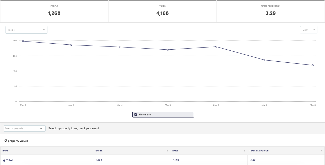
The Activity Report is a quick way to visualize your events and see which segments are contributing to the growth/decline (hopefully growth) of your site activity.
Getting Started
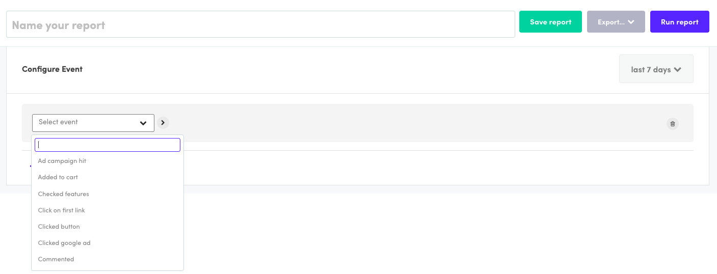
Simply choose an event and your date range, then click the Run Report button on the top right of your screen:
Results
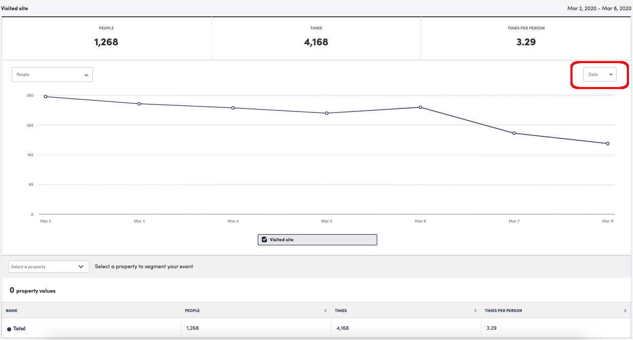
Once you’ve run your report, we’ll show you the results over the specified date range. You should see a line chart broken up in hourly, daily, weekly, monthly, or yearly data points (at most, we will show 31 data points on the screen at a given time). To change your data point period of time, simply click on the dropdown menu that controls the data point period (in the below image, you’d click on where it says ‘Daily’). You can also hover over a data point to bring up a tooltip that shows the results for that period.
Note:There may be situations where the sum of people across all data points is larger than the overall number of people shown at the top. Don’t worry, this is perfectly normal. This happens because a single person can visit the site multiple times in a given date range.
Example:I’m the only person to visit a website over the last seven days, but I visited every day. For each daily data point, we’d show one person visiting. We’d also show a total of one person visiting over the last 7 days.
People/Times/Times per Person
Across the top of the chart, you’ll see 3 numbers:
-
People - this shows the total number of unique people who performed the event across the entire date range
-
Times - this shows the total times the event was performed across the entire date range
-
Times per Person - this is times/people across the entire date range
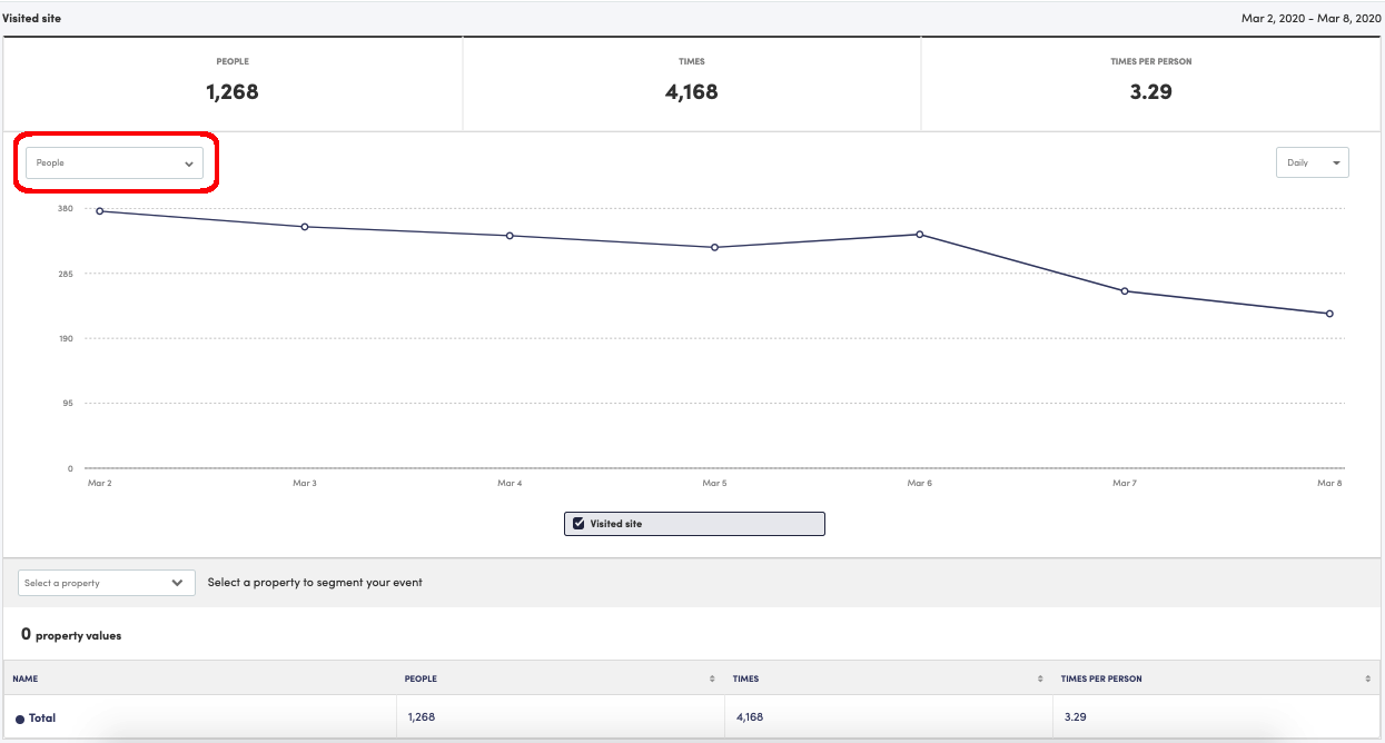
By default, we’ll chart by Total People, but you can hit the dropdown where it says People to change this to Times or Times per Person.
Event Comparison
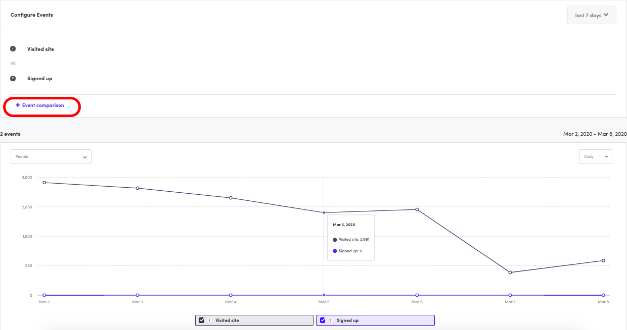
To chart multiple events at once, click the '+ Event comparison' button within a configuration. You will then be prompted to select your additional event. Once you run your report, we'll run the numbers and chart the usage of the events so you can visualize their movements over time.
Segmenting
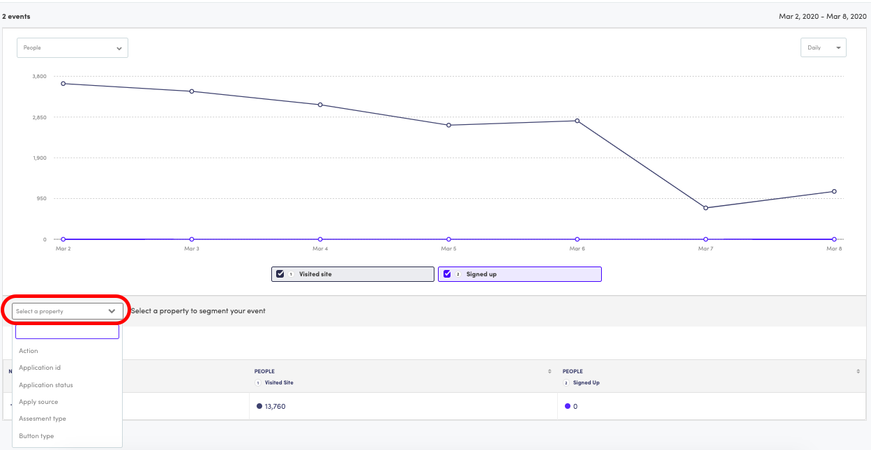
To segment your results by a property, click on the property dropdown menu. You should see the property broken out into two tabs: Event and All.
Note:For reports charting 2 or more events, you will not see the Event tab.
Event Tab
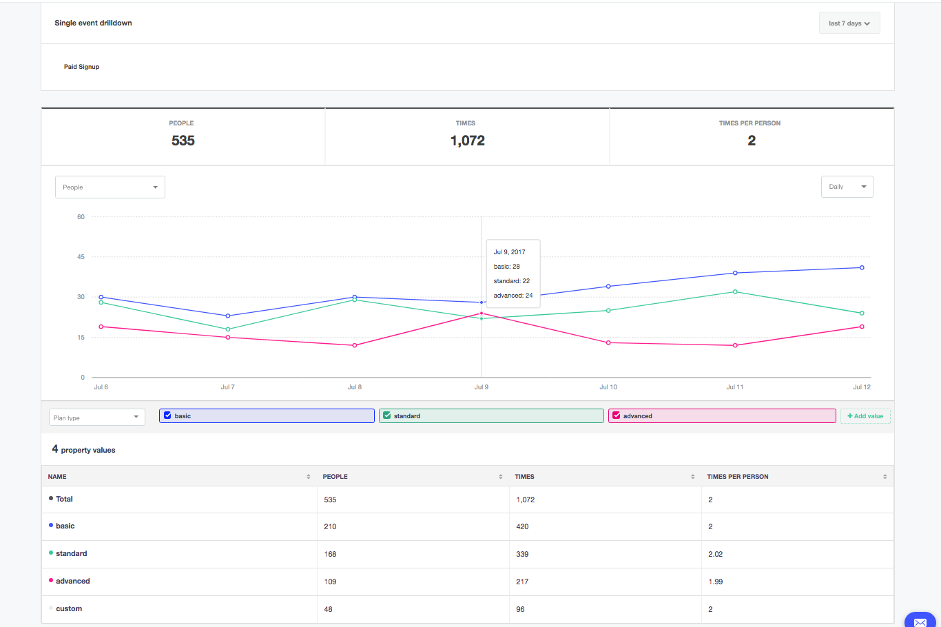
In the Event Tab, we will show you only those event properties that come into Kissmetrics with the selected event (in the above example, it would be Paid Signup). If you select one of the event properties to segment by, we will break out the number of people, times, and times per person each property value was sent in with the event.
Example:If I complete the Paid Signup event twice, once with a plan type = basic, and once with a plan type = standard, I will be counted in both segments having done each type of plan type once.
All Tab
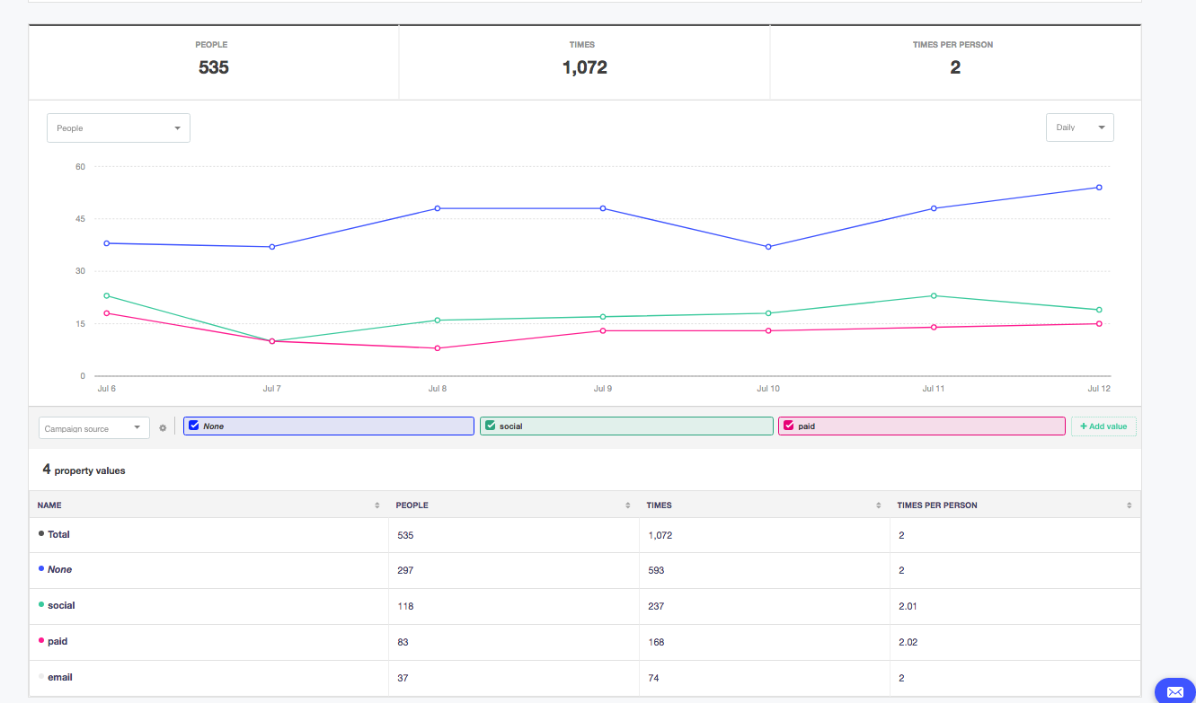
The All Tab will show you all the user properties in your Kissmetrics product. If you select one of the user properties to segment by, we will break out the number of people, times, and times per person by which value the user had at the time of doing the event chosen.
Example:If I do the Paid Signup event twice, once when I had a campaign source = google, and once when I had a campaign source = facebook , I will be counted in both segments.
Notes:
Use the All Tab properties when you’re looking to segment by properties that do not come in with an event.
You’ll also notice the presence of a ‘none’ group in the following screenshot. ‘None’ simply refers to the group of people who did not have a value (in our example, this represents the group of people who did Paid Signup but didn’t come in through a campaign).
Attribution Options
There are 3 attribution options within the Activity Report for user properties:
-
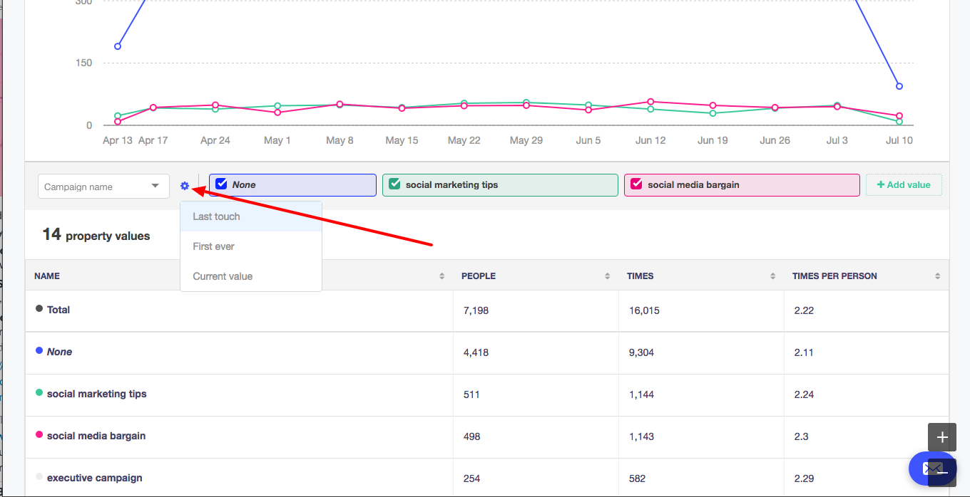
Last Touch (default) - this type of attribution will segment users according to the value they had at the time of the event.
-
First Ever - this type of attribution will segment users according to the first ever value given to each user.
-
Current Value - this type of attribution will segment users according to the most up-to-date value given to each user.
Note:Last Touch is the only type of attribution whereby a user can be bucketed into multiple values.
Example:If I purchase twice, having in come in from two different marketing campaigns, I will be shown in both campaigns. To learn more on attribution, click here
The setting to change attribution is located here:
How to add/remove property values on linechart
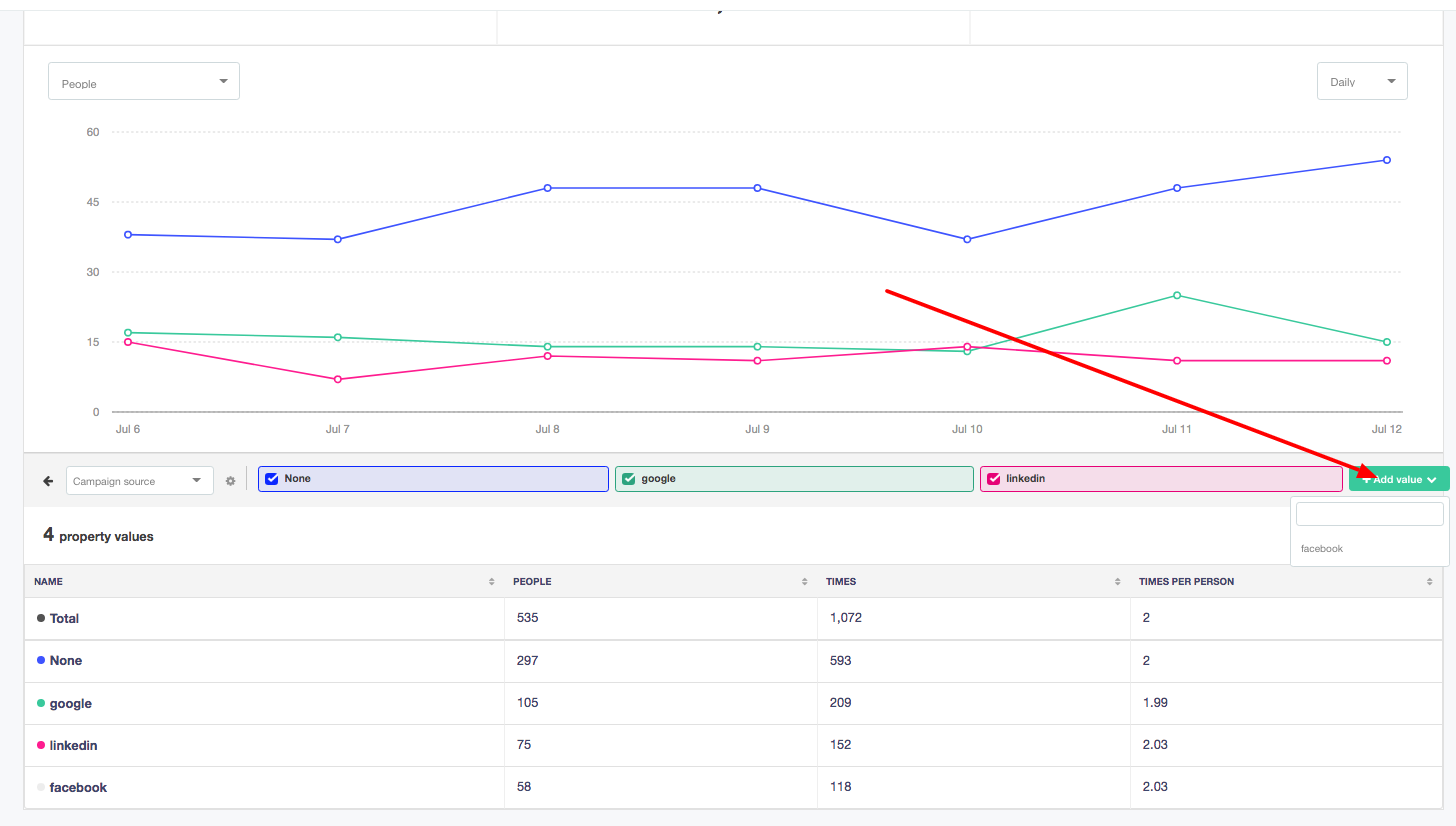
To add a value to the line chart, click on ‘+Add value’ and then select the value you’d like to add to the chart. You can have up to 5 values on the line chart at one time.
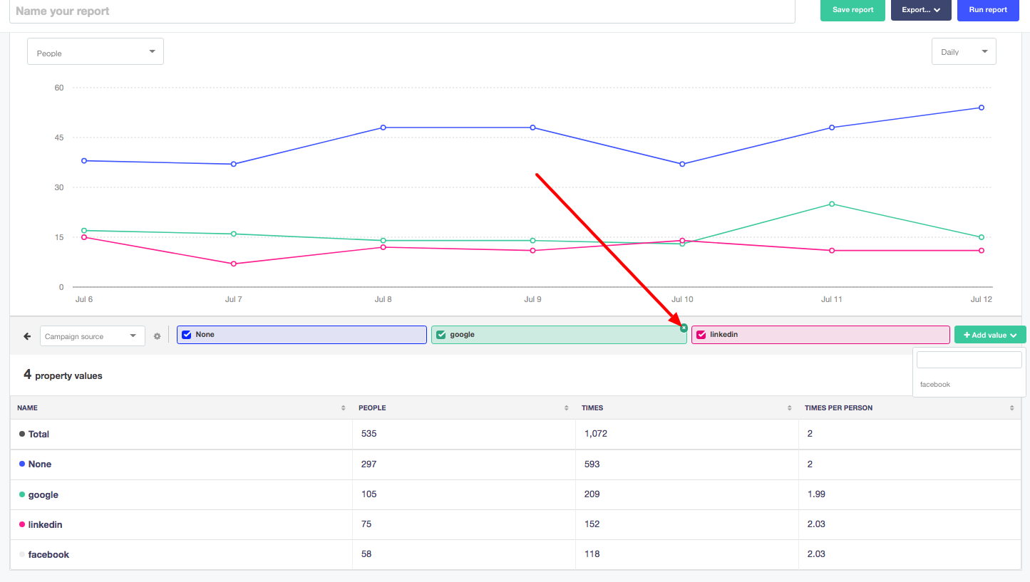
To remove a value in order to add other values, hover over the value you’d like to remove and click on the X that appears in the top right corner of the value.
Multi-level segmentation
Multi-level segmentation refers to the ability to go deeper into a specific segment. Using our same example, let’s say you’re interested in further segmenting the ‘google’ segment and understanding which city those users are located in. To do this, you’ll want to hover over the google cell. An ‘>’ should appear when you hover like so:
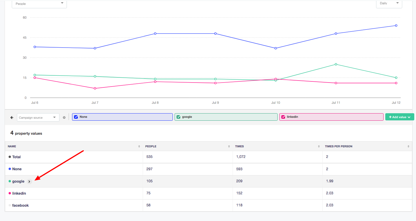
Clicking on the ‘>’ icon will bring up only the ‘google’ segment on the chart and table. You’ll now be able to further segment this group by another property (like KM City).
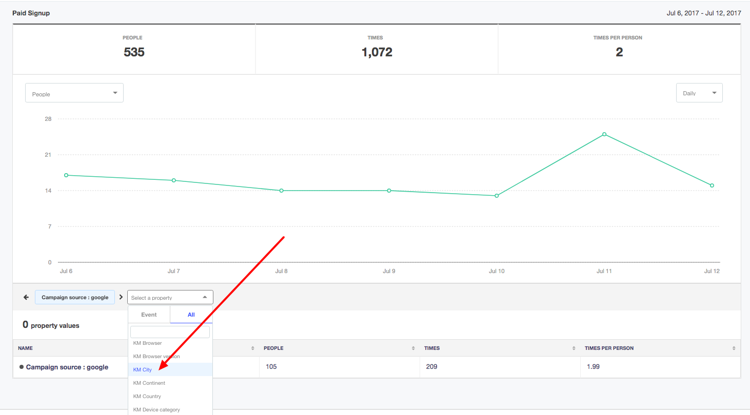
Once you’ve selected your property, we’ll show you the previous segment now broken up by another level of segmentation.
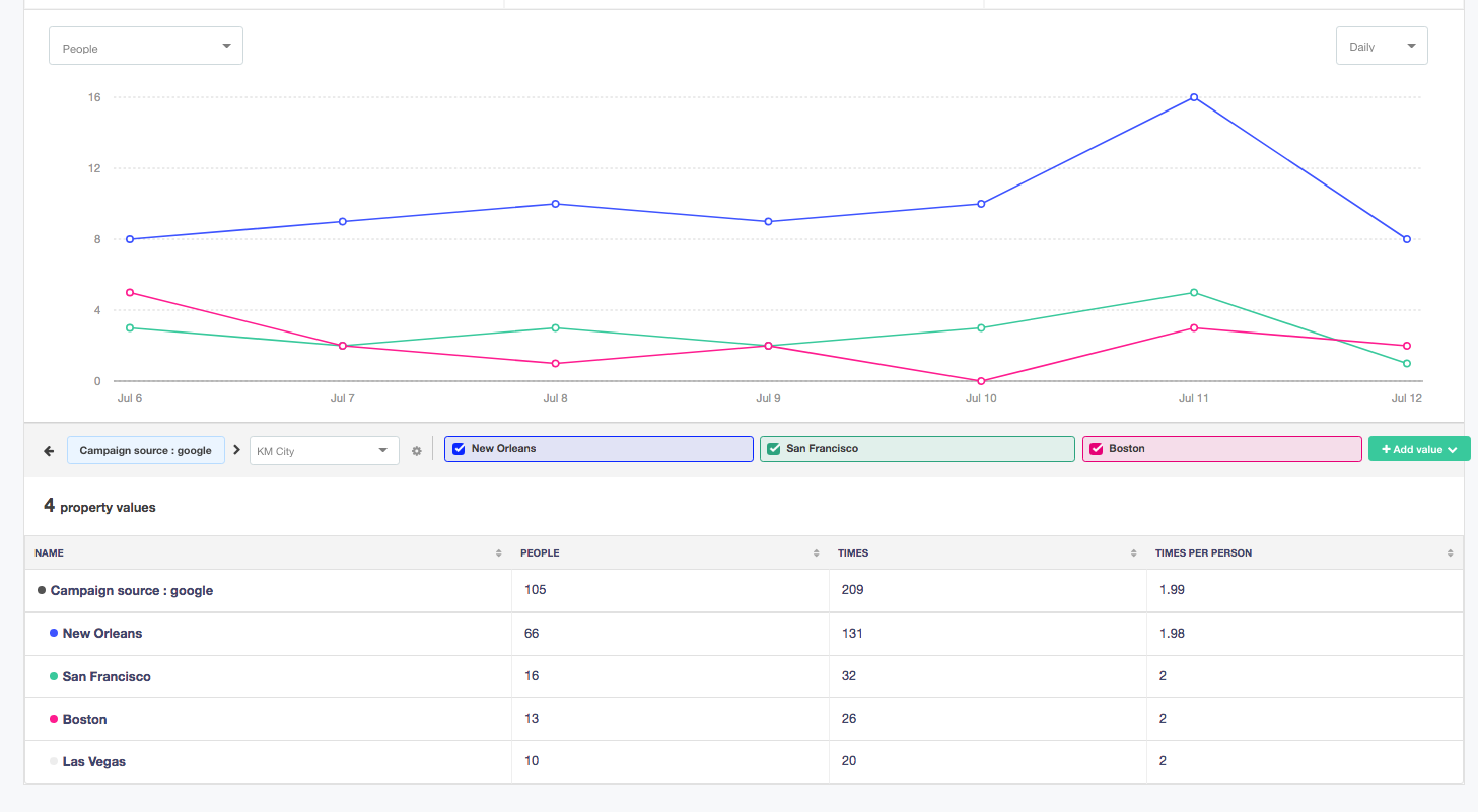
Note:You can go as far as 3 levels down.
Updated 11 months ago
